Beta, did you eat?
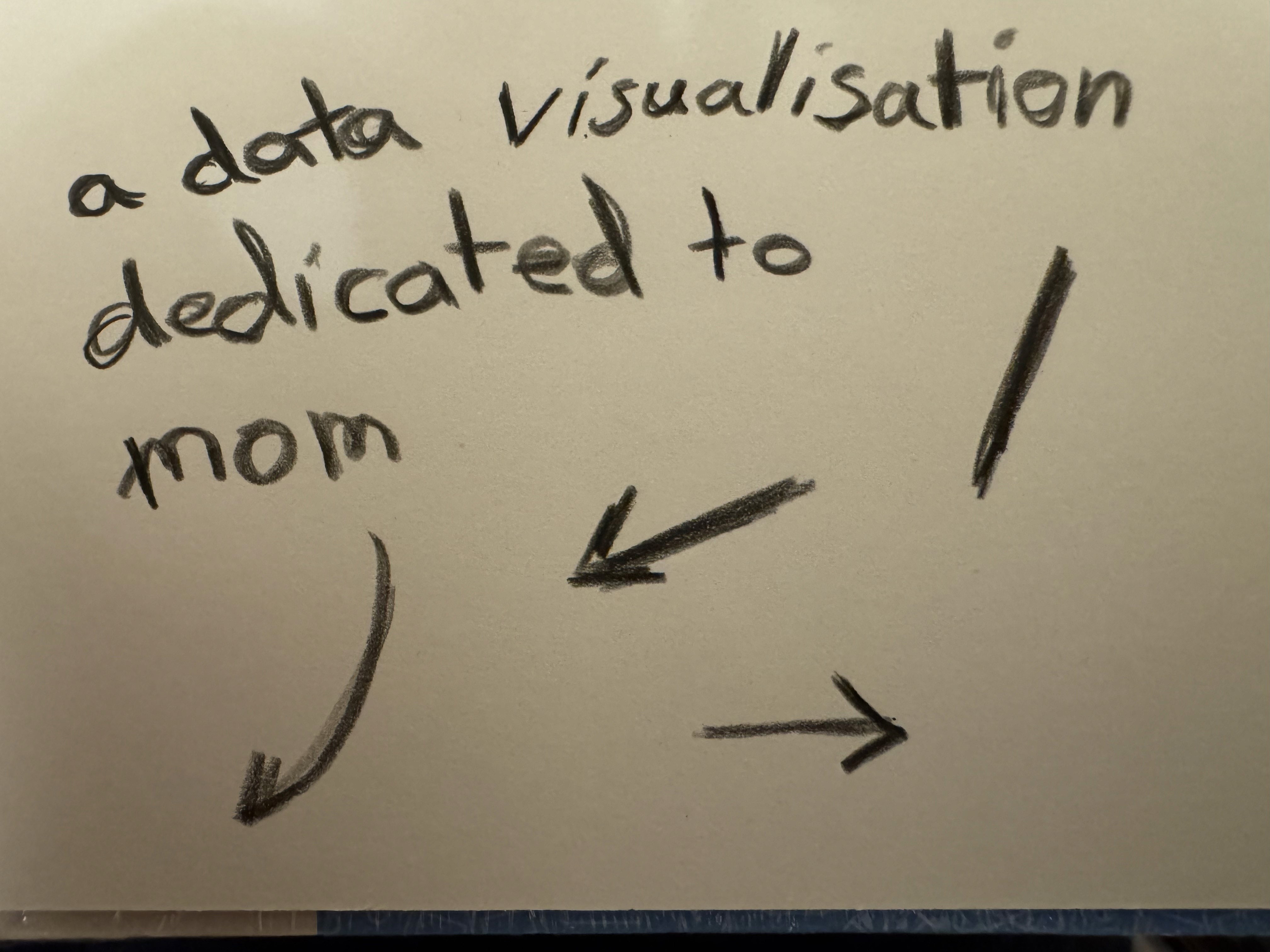
A data visualization dedicated to mom.

Summary
Quick Facts
Solo Project by Shawki
My Role(s): Data Tracker, Designer
Tools Used: Adobe Photoshop, Adobe Illustrator, Figma, Google Sheets
Release: March 2026
Timeline: 4 Weeks
Description
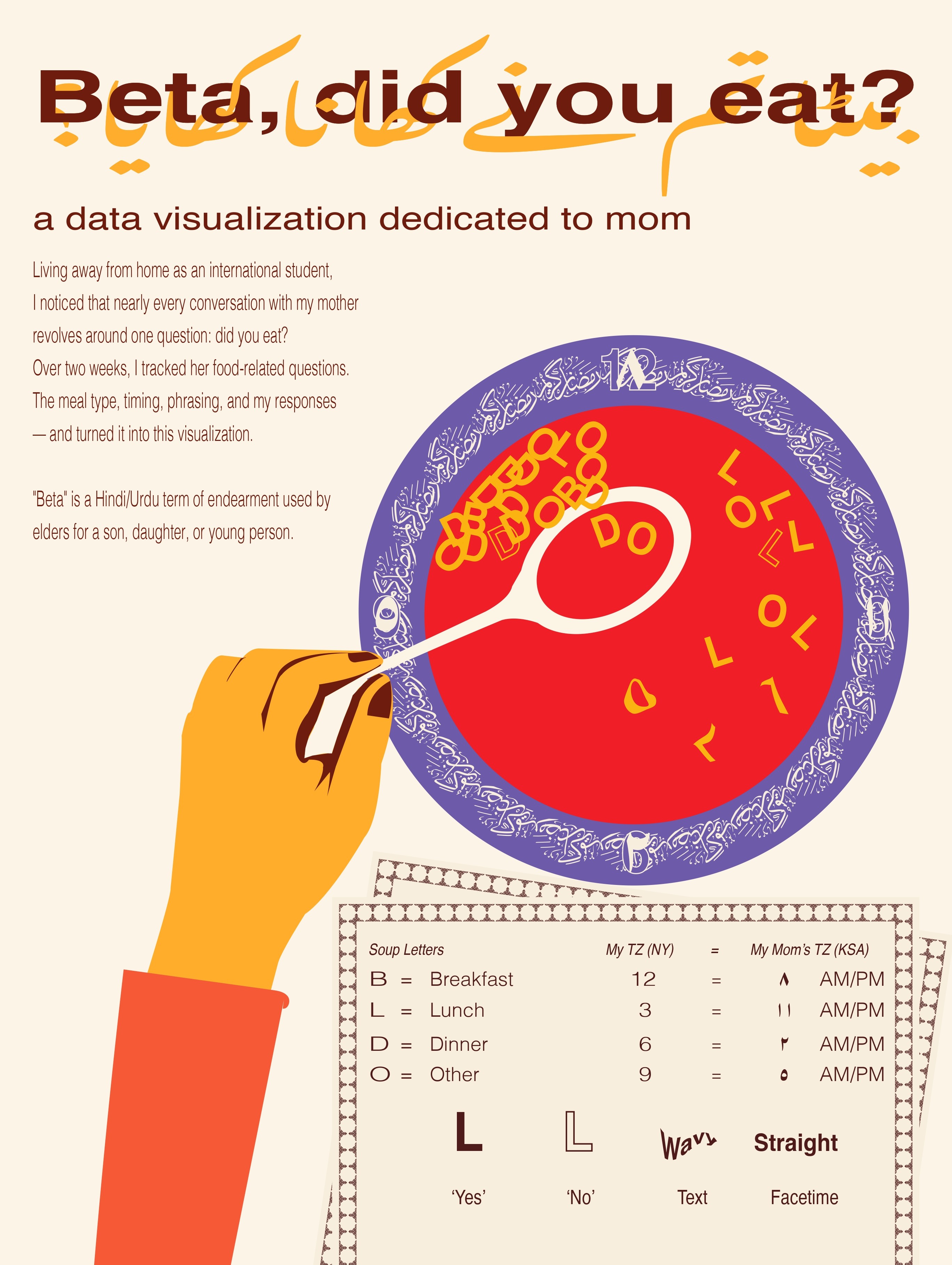
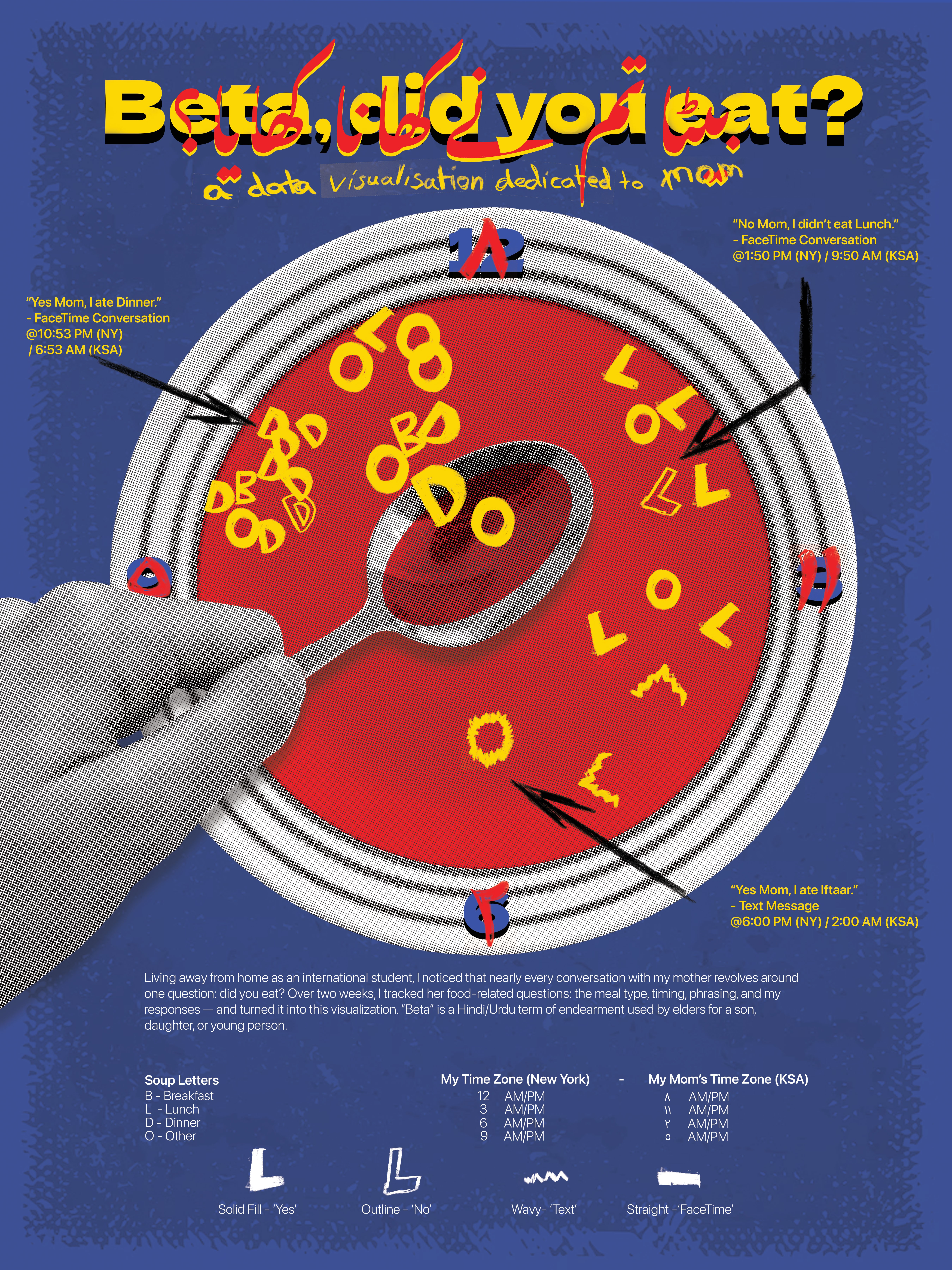
Living away from home as an international student, I noticed that nearly every conversation with my mother revolves around one question: did you eat? Over two weeks, I tracked her food-related questions — the meal type, timing, phrasing, and my responses — and turned it into this visualization. This visualization is dedicated to my mother.
"Beta" is a Hindi/Urdu term of endearment used by elders for a son, daughter, or young person. Hence the title: "Beta, did you eat?"
NOTE: The work below is a submission for my data visualization class.
Design Process
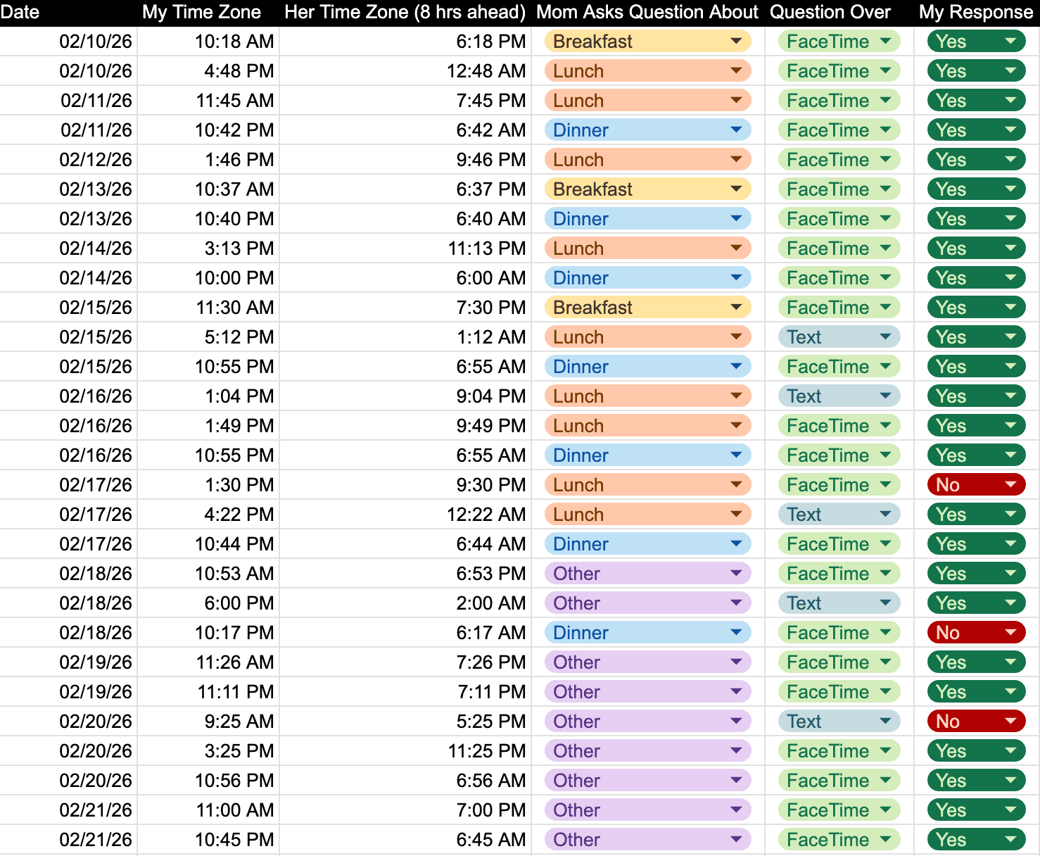
For this visualization, I tracked six data fields:
Date of communication
My time zone during communication (New York)
My mother’s time zone during communication (Saudi Arabia)
The meal referenced in her question (Breakfast, Lunch, Dinner, Other)
How she asked the question (Text or FaceTime)
My response (Yes or No)
Below is a screenshot of a portion of the collected data.
I wanted the visualization to tell a story while remaining closely tied to the theme. Two ideas immediately stood out from the dataset: time and food. This led me to think about an analog clock and a plate , both of which share a circular form.
Since the project coincided with the month of Ramadan, a holy month of fasting for Muslims, the concept became more personal. I was spending Ramadan away from my mother for the second time in the US. Every year, she prepares soup for our family to break our fast. This memory led me to the idea of alphabet soup, with letters floating inside the bowl. I began combining these elements into an initial sketch in Figma.
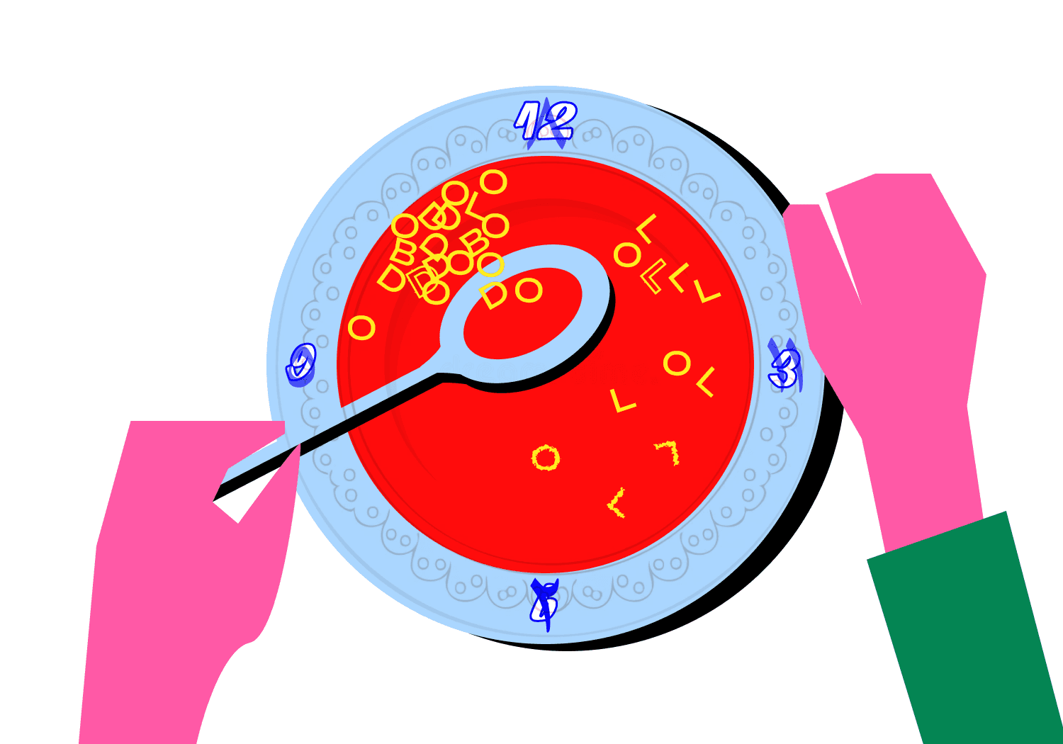
The plate features calligraphy incorporating both English and Arabic numerals. The English numerals represent the New York time zone, while the Arabic numerals represent Saudi Arabia’s time zone, which is eight hours ahead. For example, 12 AM/PM in New York corresponds to “٨” (8 AM/PM) in Saudi Arabia. The same relationship is shown for 3, 6, and 9.
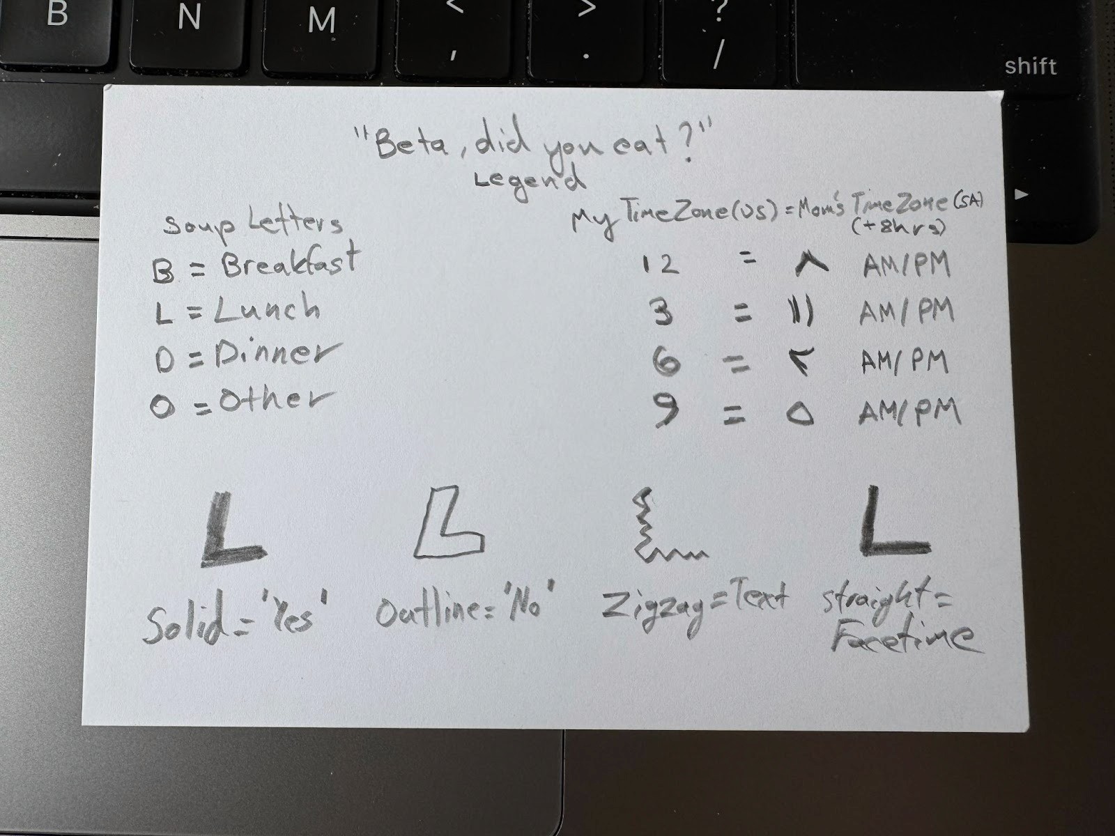
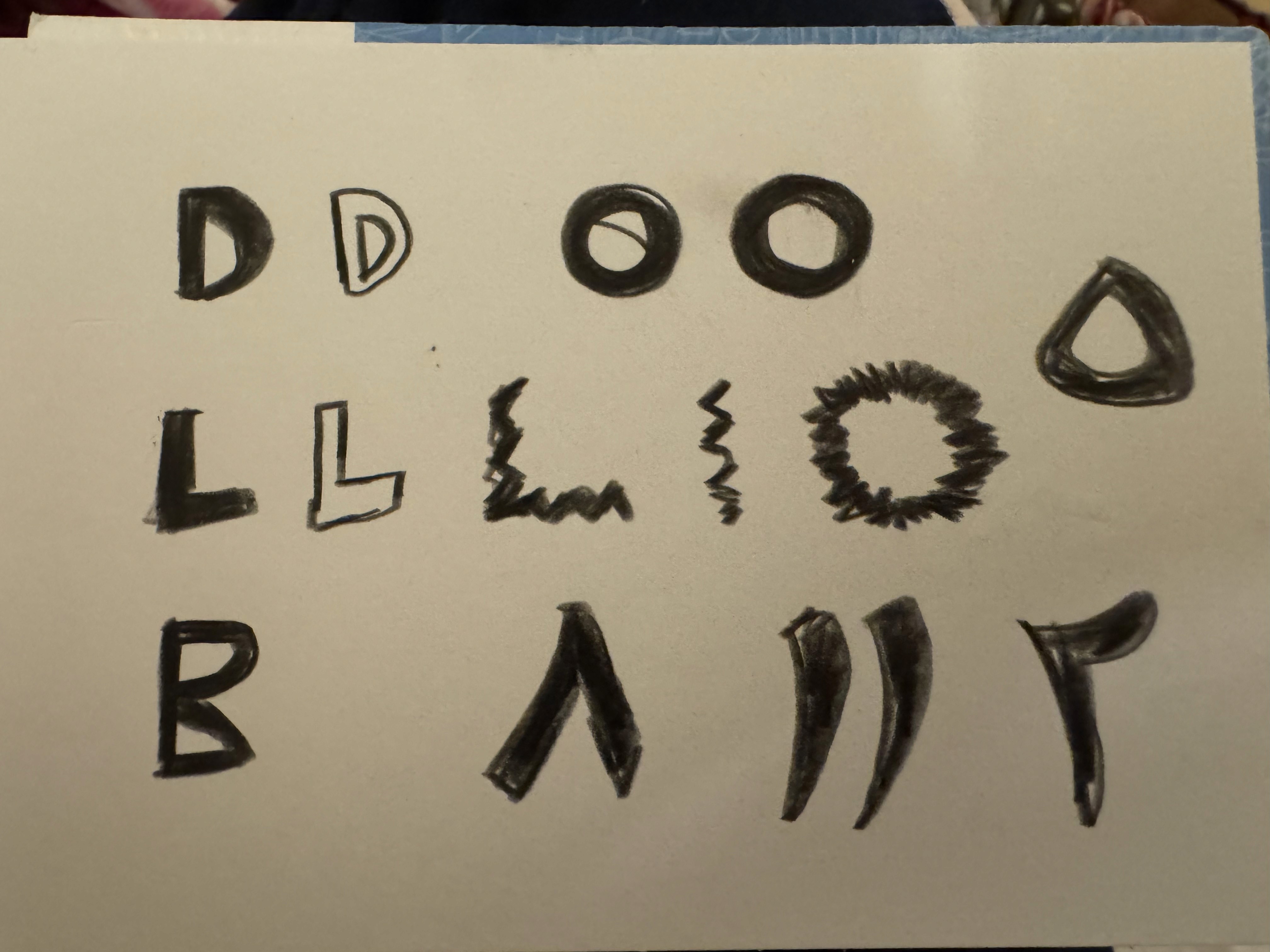
The letters in the alphabet soup represent the meal my mom asked about:
B — Breakfast
L — Lunch
D — Dinner
O — Other (primarily Ramadan-related meals)
The position of each letter on the plate indicates the time my mom contacted me. From any position, viewers can read both the New York and Saudi Arabia times, as well as determine AM or PM based on the associated meal.
Additional visual encodings include:
Solid letters indicate that I responded, “Yes, I ate.”
Outlined letters indicate, “No, I didn’t eat.”
Straight letters represent FaceTime conversations.
Zig-zag letters represent text exchanges.
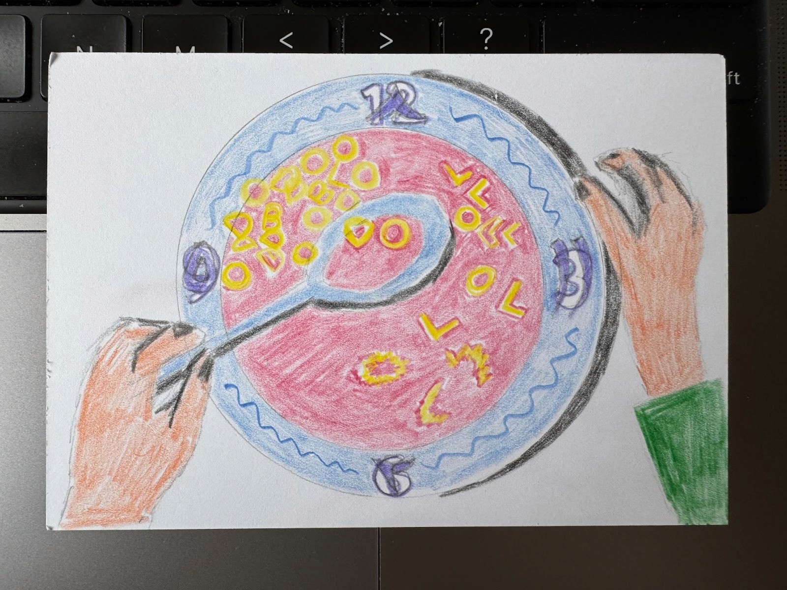
Finally, I translated the Figma concept into a hand-drawn version on a postcard. This was a requirement for the submission of the project before it was made into a poster.
Hand-Drawn Postcard
Poster Design and Feedback
Feedback
I received the following comments
Strong concept with the clock-plate visual, but the visual itself is very small and should be the main attraction. Also, minimal illustration not a vibe that resonated.
Legend and text should be reduced in size.
Difficult to read the numbers on the plate.
Use hand-drawn soup letters and improve typography overall.
Hand Drawing Effect
The last piece of feedback is something I leaned into. I though the hand drawn effect really represented the feeling of being a kid who shares something he draws with his mom. So I started making different annotations with a pencil over white paper and then used that as something to put in my next poster.
Poster Design 2.0
Changes
I made the following changes based on the feedback from the class
Made the plate/clock the biggest thing on the poster to direct focus to the data visualization before anything else.
Hand drawn typography became a big part of the visual language and also expressed the angle of a kid doing something for his parent.
Used a retro-editorial inspired vibe this time to make the colors pop up more against the plate.
Put an easter egg of myself (that's my hand and reflection in the spoon).
Future Renditions?
Currently still refining the poster to strike the balance between legibility and artistic expression. But for now, these two will be framed in my make-shift basement apartment in the city.